Data visualization is rapidly becoming an essential skill in data science and many other data-driven industries, such as finance, education, and healthcare. It is an essential tool for businesses looking to transform complex data into clear, actionable insights. With the growing reliance on data-driven decision-making, representing information in a way that’s easily understood is vital to staying competitive.
From tracking performance metrics to identifying trends and patterns, data visualization methods provide businesses with the clarity they need to make informed choices. Charts, graphs, and interactive visuals simplify data interpretation and improve communication across teams, helping them collaborate more effectively. Consult with IT Outsourcing New Jersey to choose the right visualization method that can unlock new opportunities, streamline processes, and drive business success.
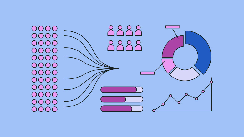
In this blog, we will explore various data visualization methods that help your business thrive.
What Is Data Visualization in Business?
Data visualization is the practice of representing data in graphical formats like charts, graphs, and maps. This makes it easier to understand the data, detect trends, and identify anomalies. The main goal of data visualization is to enable business leaders and analysts to make faster, more informed decisions based on insights derived from the visual representation of their data.
8 Key Data Visualization Methods for Business
- Bar Charts
Bar charts are a fundamental method of visualizing data commonly used in business to represent categorical data through rectangular bars. The length of each bar corresponds to the value it represents, making it easy to compare different categories or track changes over time.
Bar charts are particularly effective for displaying discrete data sets and identifying trends, patterns, and outliers within the data. They provide a clear visual representation that helps stakeholders make informed decisions based on the presented information. When creating bar charts for business purposes, it is essential to ensure they are correctly labeled, scaled, and formatted to enhance readability and understanding of the presented data.
- Pie Charts
Pie charts serve as a commonly utilized data visualization method in business to accurately represent the proportions of a whole. These circular graphs are divided into slices, each representing a different category or proportion of the data. Pie charts effectively demonstrate how individual parts contribute to the whole, enabling easy comparison of the sizes of distinct categories at a glance.
When using pie charts in business presentations or reports, limiting the number of slices is crucial to ensure clarity and avoid clutter. Additionally, labeling each slice with percentages or actual values can provide further insight into the presented data.
- Line Graphs
When it comes to critical data visualization methods for businesses, line graphs are a fundamental tool for illustrating trends and relationships over time. Line graphs are handy for showing how variables change relative to one another, making them ideal for displaying changes in data points such as sales figures, stock prices, or website traffic over a period of time.
Businesses can quickly identify patterns, trends, and correlations within their datasets by plotting data points on a graph with lines connecting them. When using line graphs, ensure that the axes are clearly labeled, the data points are accurately represented, and the graph is easily interpreted at a glance.
- Scatter Plots
Scatter plots are a crucial data visualization method used in business to illustrate the relationship between two variables. By plotting individual data points on a graph, scatter plots help in identifying patterns, trends, and correlations within the data.
Each data point represents an observation, making it easy to understand how two variables interact. Scatter plots are especially useful for pinpointing outliers and clusters within the dataset, making them an essential tool for businesses seeking insights from their data in a visually intuitive manner.
- Heat Maps
Heat maps are a valuable data visualization method for businesses aiming to uncover patterns and trends within their data. By utilizing color gradients to represent values, heat maps offer a visual representation of data that facilitates the quick identification of areas of interest or concern. This method is beneficial for analyzing large datasets and identifying correlations between variables.
Heat maps can aid businesses in making informed decisions by highlighting key areas that require attention or further analysis. They can be a powerful tool for enhancing data interpretation and informing strategic business decisions based on clear visual representations of complex data.
- Bubble Charts
Bubble charts are a valuable data visualization method commonly employed in business settings to illustrate three dimensions of data. This type of chart uses bubbles or circles to represent data points, with the size of the bubble indicating the data point’s value. The x and y axes typically represent two variables, while the bubble size represents a third variable.
Bubble charts can effectively illustrate relationships between different data points and are particularly useful for showcasing patterns, trends, and outliers within datasets. When utilized correctly, bubble charts can provide valuable insights that support decision-making processes within a business context.
- Box and Whisker Plots
Box and whisker plots are a powerful data visualization method commonly used in business to display the distribution of a dataset. This type of plot provides a clear summary of the data’s central tendency, dispersion, and potential outliers. The “box” represents the interquartile range, with the median displayed as a line within the box.
The “whiskers” extend to show the range of the data, excluding outliers that are represented as individual points beyond the whiskers. Box and whisker plots offer a concise way to understand the spread and variability of data, making them an essential tool for businesses seeking to gain insights from their datasets.
- Gantt Charts
Gantt charts are a fundamental data visualization method utilized in business for project management. These charts provide a visual representation of a project schedule, outlining tasks, timelines, and dependencies.
Gantt charts enable project managers to track progress, allocate resources efficiently, and identify potential bottlenecks or delays by displaying this information in a clear and structured format. This method is particularly useful for complex projects with multiple phases or team members, as it helps in coordinating efforts and ensuring that the project stays on track.
Conclusion
Data visualization is a powerful tool that can unlock valuable insights, driving business success in today’s data-driven environment. Businesses can make informed decisions, communicate more effectively, and stay ahead of the competition by using suitable visualization methods, whether it’s bar charts, heat maps, scatter plots, or bubble charts. Whether your goal is to improve performance, track trends, or enhance collaboration, the right data visualization method can be the key to transforming your data into actionable business insights. For more information, contact the IT Support New York team.